How to Use Color Psychology in Your Interior Design Strategy
1 March 2026
Color is more than just paint on the walls—it’s emotion, energy, and expression. Think about it: have you ever walked into a room and felt instantly calm or oddly anxious without knowing why? That’s color psychology doing its thing. When it comes to interior design, the colors you choose can completely change how a space looks and feels. So, if you're decorating a home, staging for a sale, or just want your space to feel more "you," it's worth diving into how color psychology can guide your decisions.
Let’s unpack how you can use color psychology in your interior design strategy to create a home that not only looks amazing but feels amazing too.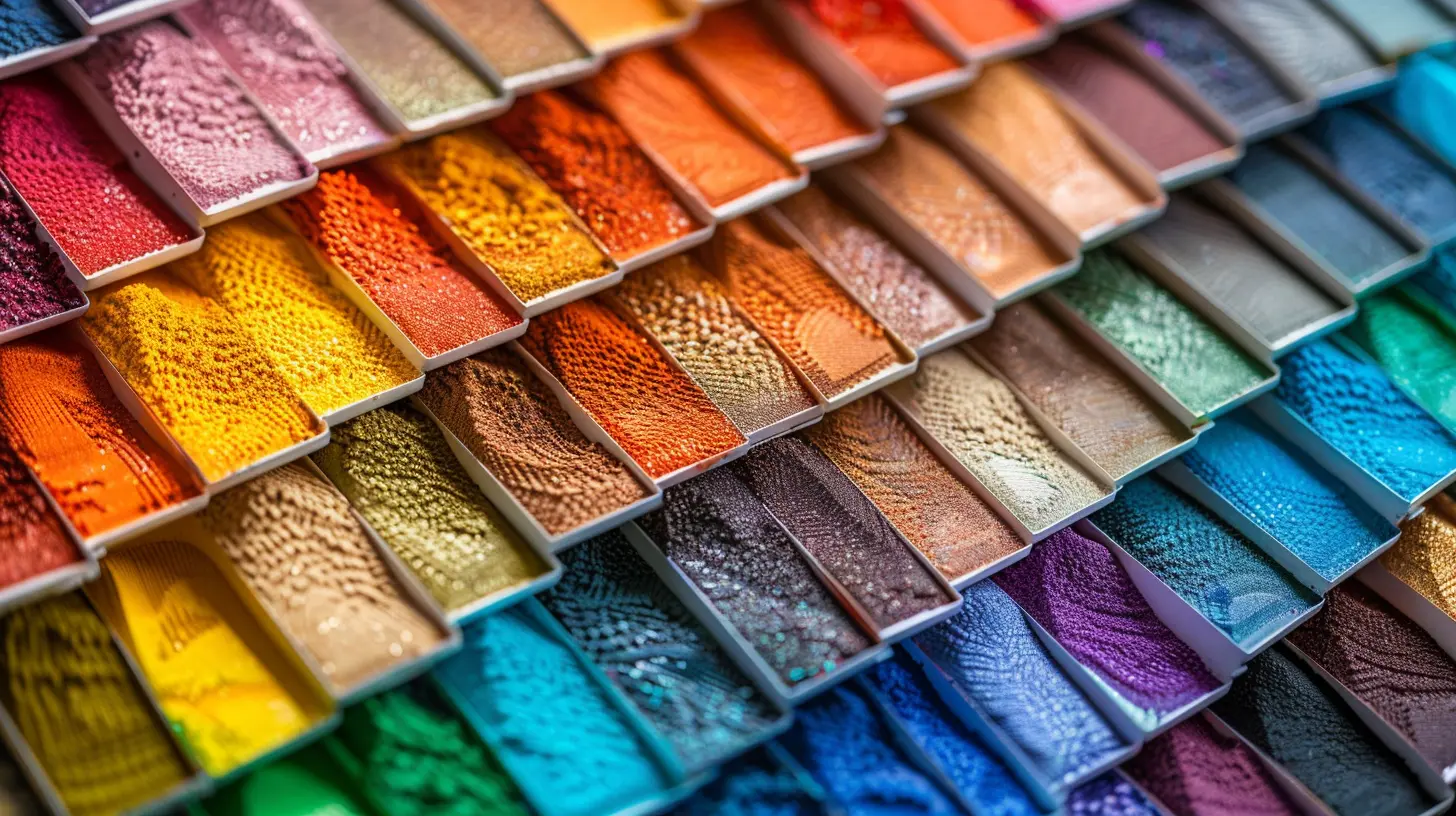
What is Color Psychology Anyway?
Color psychology is the study of how colors affect human emotions and behaviors. It’s why fast food joints use reds and yellows (they trigger hunger), and spas opt for cool greens and blues (they soothe and calm). In interior design, tapping into this science can help you shape the energy of each room in your home.Color can influence your mood, sleep quality, concentration, appetite—you name it. So, designing your interior with color psychology in mind is like giving your home a mood-boosting makeover.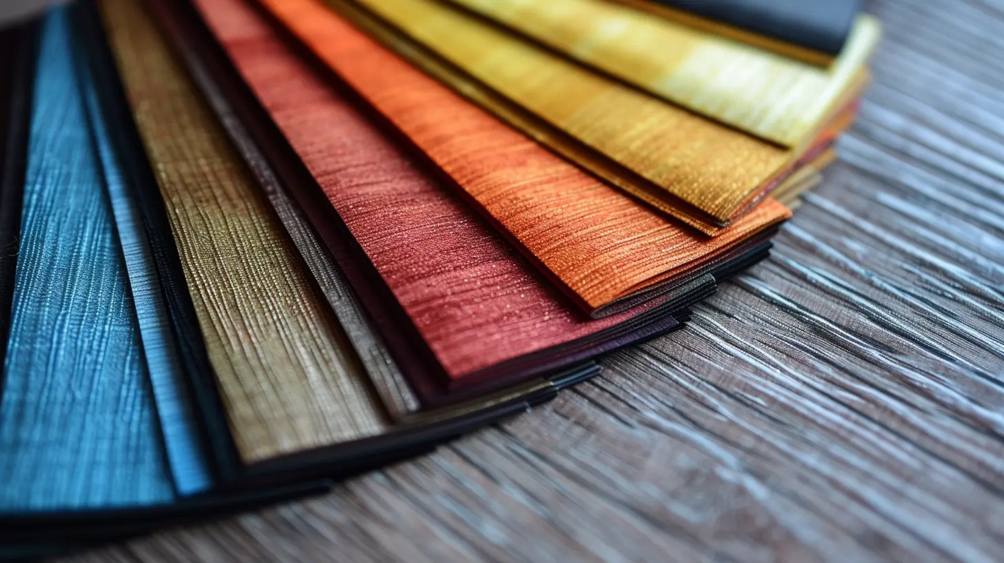
The Basics: Warm vs. Cool Colors
Before we dig into specifics, let’s quickly break down the two main color families:- Warm Colors: Reds, oranges, and yellows. These tend to energize, stimulate, and bring a sense of coziness.
- Cool Colors: Blues, greens, and purples. These promote calm, relaxation, and freshness.
Each has its place depending on what vibe you want a room to project. Think of warm colors as conversation starters and cool colors as mood-setters.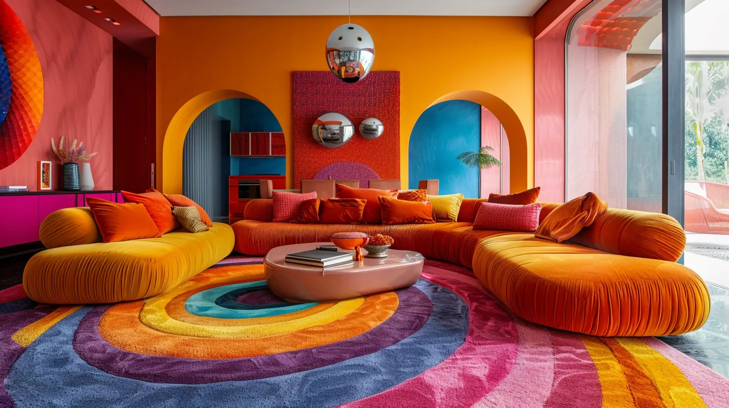
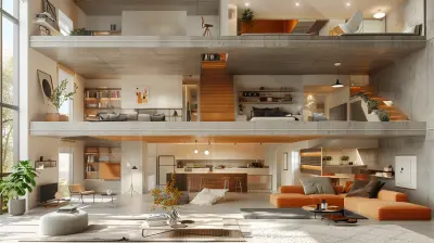
Choosing the Right Color for Each Room
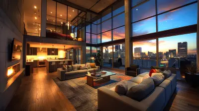
Now, let’s walk through your home one room at a time and see how color psychology can work its magic.🛋️ Living Room: Encouraging Connection and Comfort
Your living room is where conversations flow and guests gather. You’ll want colors that are welcoming and subtly energizing.- Best Color Choices:
- Soft yellows: Uplifting and warm without being too loud.
- Earthy tones like terracotta or warm beige: Grounding and cozy.
- Greige (gray + beige): A balanced neutral that adapts to different lighting and moods.
Avoid overly dark or cold hues unless you’re going for a very specific, moody aesthetic.
🍽️ Dining Room: Stimulate the Appetite and Conversation
Anyone hungry? Surprisingly, certain colors can make food look more appealing and even make us feel hungrier.- Best Color Choices:
- Rich reds or burnt orange: These are appetite enhancers and spark lively discussions.
- Warm neutrals like taupe or caramel: Sophisticated yet cozy.
Skip blues and greens here—they’re great colors, but they tend to suppress appetite.
🍳 Kitchen: Clean, Fresh, and Energizing
Kitchens thrive on brightness and energy. Since this space is all about function and vibe, you want colors that feel clean and inviting.- Best Color Choices:
- Crisp white: Clean and classic, especially with pops of color.
- Sunny yellow: Cheerful and homey.
- Mint green or light aqua: Cool, refreshing, and modern.
Stay away from dark, heavy shades unless you’ve got ample natural light and a really bold design concept.
🛏️ Bedroom: Your Personal Relaxation Zone
Your bedroom should be your zen den. Think calm, comfort, and serenity all day, every day.- Best Color Choices:
- Soft blues: Known to lower blood pressure and heart rate—perfect for sleep.
- Lavenders or dusky purples: Calming without being boring.
- Pale green or sage: Relaxing and refreshing.
Avoid intense reds or oranges here unless you want to feel like you’re constantly caffeinated.
🚿 Bathroom: Spa-Like Peacefulness
Bathrooms are where you want to feel clean, quiet, and refreshed. Like a mini retreat every morning.- Best Color Choices:
- Cool grays: Sleek and sophisticated.
- Seafoam or sky blue: Reminds us of water and clarity.
- White with natural accents (wood/stone): Feels fresh and timeless.
Avoid dark greens or browns—they can make the space feel heavy or outdated.
🧸 Kids’ Rooms: Energy and Imagination
For kids, color plays a big role in behavior—think stimulation, creativity, and calm (yes, calm is possible with kids).- Best Color Choices:
- Soft pastels like peach, mint, or lilac for nurseries: Gentle and soothing.
- Bright but not overwhelming colors like turquoise, coral, or sunny yellow for older kids: Stimulating without being chaotic.
Too much red can lead to restlessness or overstimulation—best used as an accent only.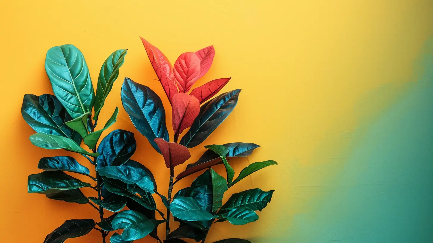
The Emotional Impact of Popular Colors
Let’s break it down by color and how each can impact mood and space:🔴 Red
- Stimulates excitement, passion, and energy.- Great for dining rooms or bold accents in social spaces.
- Too much? It can feel aggressive or stressful.
🟠 Orange
- Evokes enthusiasm and creativity.- Perfect for workout spaces or creative nooks.
- Can be overwhelming if overdone—use sparingly.
🟡 Yellow
- Uplifting, cheerful, and attention-grabbing.- Works well in kitchens, dining areas, and small accent walls.
- Too much yellow can trigger anxiety or irritability.
🟢 Green
- Associated with balance, nature, and renewal.- Ideal for bedrooms, living rooms, and home offices.
- Pairs beautifully with natural materials.
🔵 Blue
- Calms the nervous system and promotes serenity.- Great in bedrooms, bathrooms, or study spaces.
- Dark blues can feel cold if overused in poorly lit areas.
🟣 Purple
- Tied to creativity, luxury, and spirituality.- Works well in meditation rooms, bedrooms, or accent pieces.
- Can look overly dramatic if used in large doses.
⚫ Black
- Symbolizes sophistication and power.- Use as an accent to add depth or drama.
- Too much black can make a space feel closed off.
⚪ White
- Clean, simple, and classic.- Excellent for small spaces or minimalist designs.
- Can feel sterile if not balanced with texture and warmth.
Don’t Forget About Neutrals
Neutrals are the unsung heroes of interior design. They’re not boring—they’re versatile.- Gray: Elegant and modern, but can feel cold without warm accents.
- Beige: Safe and cozy, works almost anywhere.
- Greige: A blend of cool and warm, the best of both worlds.
- Taupe: Earthy and calming, great as a background color.
Use neutrals as a base and layer in color through accessories and textures—you’ll keep flexibility without losing personality.
Lighting Matters—A Lot
Here’s a biggie: the same paint color can look totally different depending on the lighting. Natural light changes throughout the day, and artificial lighting (warm vs. cool tones) can also impact how we perceive color.Before committing to a color:
- Test samples on different walls.
- Observe them in morning, afternoon, and evening light.
- Consider the lightbulbs you're using—LED vs. incandescent can shift hues drastically.
How to Incorporate Color Without Going Overboard
Love the idea of color but scared of turning your home into a crayon box? Totally fair. Here are some low-commitment ways to test the waters:- Accent walls: A bold wall can add personality without overwhelming a room.
- Furniture pieces: Try a colorful sofa or painted cabinet.
- Decor: Throw pillows, rugs, and art are great for color pops.
- Plants: Greens add life—literally and visually.
Start small, build confidence, and remember—you can always repaint.
Color and Resale Value: What Buyers Love
If you're designing for resale, be a little strategic. Some buyers may not appreciate a lime green kitchen or a purple living room. Neutrals and light tones generally have broader appeal.Real estate experts agree:
- Soft gray, white, and beige are safe bets.
- Add color through easily changeable decor, not permanent features.
- Stick to a cohesive color story to make the home feel intentionally designed.
Final Thoughts: Make It Personal
At the end of the day, your home should reflect you. Trends come and go, but how you feel in your space is what really matters. Use color psychology as a guide, but trust your gut, too.If a bright orange wall makes you smile every morning—paint it. If navy blue brings you peace—go for it. Color psychology isn’t about rules, it’s about results. So make your space work for your mind, your mood, and your lifestyle.
all images in this post were generated using AI tools
Category:
Interior DesignAuthor:

Mateo Hines
Discussion
rate this article
2 comments
Ulysses McPherson
Great insights! I never realized how impactful color can be in design. This article provides valuable tips for anyone looking to enhance their space!
March 7, 2026 at 4:51 AM
Mateo Hines
Thank you for your kind words! I'm glad you found the article helpful in exploring the power of color in design.
Davina Hughes
Transform your space into a mood playground! 🎨✨ Want your living room to feel like a sunny beach? Paint it in uplifting yellows! Feeling adventurous? Go bold with electric blues! Remember, color is not just a hue; it’s the mood ring for your home. Happy decorating, color wizards!" 🏡🌈
March 6, 2026 at 7:44 PM
Mateo Hines
Thank you for your enthusiastic comment! Transforming your space with color is indeed a powerful way to influence mood and create a unique atmosphere. Happy decorating! 🌟