How to Choose the Perfect Color Palette for Your Space
16 August 2026
Picking the perfect color palette for your space is like choosing the right outfit for a first date—you want it to impress, reflect your personality, and make you feel comfortable. But with so many options out there, where do you even begin?
Don’t worry! Whether you’re revamping a single room or giving your entire home a fresh look, I’ve got you covered. In this guide, we'll dive into the art (and science) of selecting colors that harmonize, elevate your space, and (most importantly) make you happy. 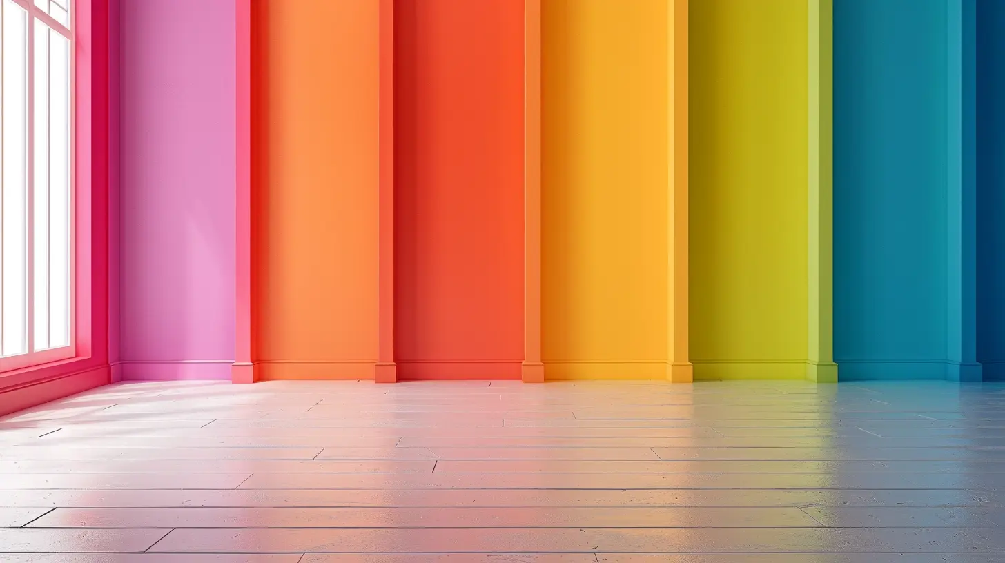
Why Color Matters in Interior Design
Colors do more than just make a space look good—they set the mood, influence emotions, and even impact how large or small a room feels. Ever wonder why spas use cool, calming tones like blue and green? Or why fast-food restaurants often feature bold reds and yellows? That’s the psychology of color at work!When choosing a palette for your space, consider how you want to feel in each room. Cozy? Energized? Relaxed? Each color evokes a unique vibe, so it’s important to be intentional. 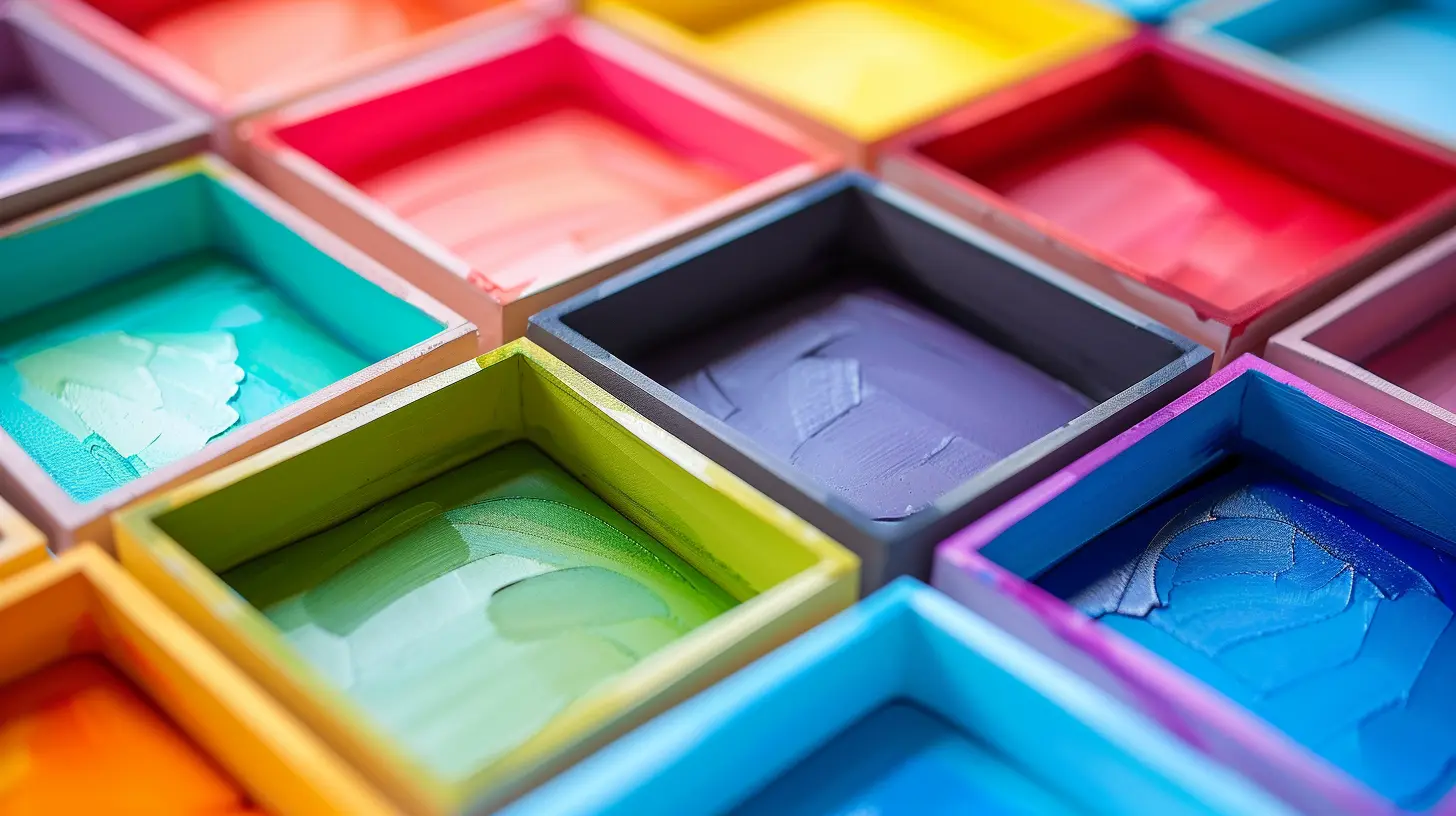
Step 1: Identify Your Vibe
Before you go wild with paint swatches, take a moment to decide what kind of atmosphere you want in your space.- Do you want a cozy and inviting feel? Warm tones like beige, terracotta, or mustard yellow can create a snug and welcoming environment.
- Looking for something fresh and airy? Cool tones like sky blue, sage green, or soft lilac can make a space feel light and peaceful.
- Want to make a bold statement? High-contrast hues like deep navy, emerald green, or charcoal gray can add drama and sophistication.
- Prefer a timeless and elegant look? Neutral colors, like taupe, white, or soft gray, offer flexibility and never go out of style.
Once you narrow down the overall mood, you’ll have an easier time deciding on a cohesive color scheme. 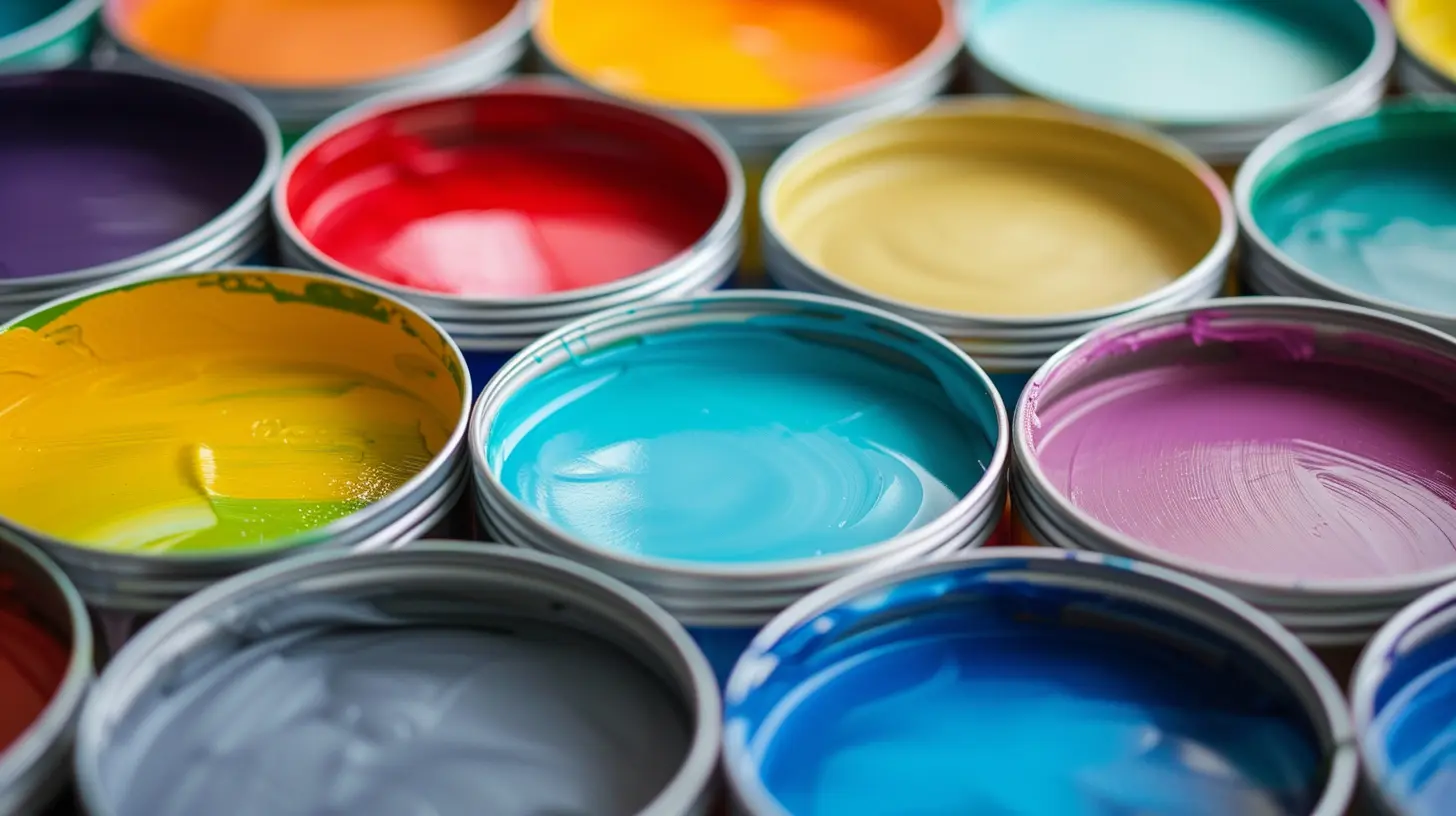
Step 2: Understand Color Theory
Interior designers swear by color theory—and no, you don’t need an art degree to grasp the basics!The Color Wheel
The color wheel is your best friend when it comes to picking harmonious shades. Here’s how it works:- Complementary colors: These sit opposite each other on the color wheel (think blue and orange, red and green). They create high contrast and energy.
- Analogous colors: These are next to each other on the wheel (like blue, teal, and green). They create a more harmonious, serene feel.
- Monochromatic colors: Different shades of the same color (like light blue, navy blue, and sky blue). This approach creates depth while keeping it simple.
Once you understand these relationships, it’s much easier to mix and match colors that won't clash. 
Step 3: Consider Lighting
Lighting changes everything! A color that looks stunning in a brightly lit store can appear completely different in your dimly lit living room.Natural light, warm bulbs, or cool LED lights will all affect how a color appears. Before committing to a shade, test it out in different lighting conditions throughout the day. Paint a small wall section or use large color samples and observe how it changes from morning to night.
Step 4: Use the 60-30-10 Rule
If you're worried about a room looking too busy or chaotic, follow the 60-30-10 rule—an easy formula to maintain balance:- 60% of the dominant color: This is your main hue (usually walls, large furniture, or flooring).
- 30% of a secondary color: This supports your main color without overpowering it (think accent furniture, curtains, or area rugs).
- 10% of an accent color: This is where you can add personality—throw pillows, artwork, or decorative pieces.
This simple trick keeps your space looking cohesive and effortlessly stylish.
Step 5: Get Inspired!
Not sure where to start? Inspiration is everywhere!- Nature: Think of a beach sunset with soft pinks, deep blues, and warm beige sand—nature offers some of the best color combinations.
- Your wardrobe: If you love wearing certain colors, chances are you'll enjoy them in your home too!
- Pinterest and Instagram: Social media is overflowing with stunning interior design ideas. Create a mood board and see what colors you naturally gravitate toward.
- Paint Stores: Many paint brands offer pre-made color palettes to simplify decision-making.
Step 6: Test Before You Commit
Found a color you love? Don't rush into painting your entire wall just yet!Most paint stores offer sample sizes for a reason—test before you commit. Paint a small section of the wall and live with it for a few days. This will help you see how the color looks in different lighting and ensure you absolutely love it before going all in.
Step 7: Don’t Be Afraid to Break the Rules
At the end of the day, your home should reflect YOU. If you love a bold, unconventional mix of colors—go for it! Some of the most stunning interiors break traditional rules in the most beautiful ways.The key is to choose colors that make you feel good. Trends come and go, but your home should always be a space that feels like "you."
Bonus Tip: Use Paint Apps
Still unsure? Many paint brands offer virtual paint apps where you can upload a photo of your space and "try on" colors before buying. It's like using a Snapchat filter, but for your walls!Final Thoughts
Choosing the perfect color palette is part science, part art, and a whole lot of fun! Start with the mood you want to create, understand basic color theory, and don’t forget to test your choices in different lighting.Most importantly, trust your gut—pick colors that make your home feel like the perfect reflection of you. Now, grab those paint swatches and start transforming your space!
all images in this post were generated using AI tools
Category:
Interior DesignAuthor:

Mateo Hines
Discussion
rate this article
2 comments
Charlotte McWain
Color your world and brighten your space... have fun!
September 5, 2026 at 3:29 AM
Winona McAnally
Choosing a color palette is about harmony and mood. Consider natural light and room function. Test samples in the space to see how colors truly interact throughout the day.
August 22, 2026 at 4:04 AM
Mateo Hines
Great points! Testing samples really makes a difference in seeing how colors change with light. Thanks for sharing!